7 Interior Paint Colors That Make San Antonio Rooms Look Larger
Small rooms can feel tight and uncomfortable, even when the furniture is scaled correctly and the layout makes sense. Low ceilings, narrow walls, or limited natural light often create visual boundaries that make a space feel boxed in. In many San Antonio homes, these challenges are common, especially in older floor plans or interior rooms that don’t receive consistent daylight.
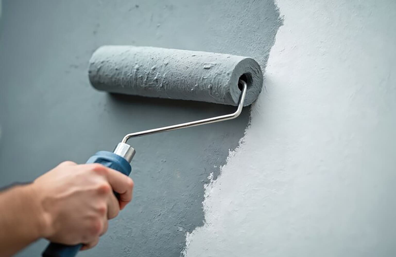
One of the most effective ways to open up a room is through smart paint color selection. The right shade can reflect light more evenly, soften edges, and create the illusion that walls are farther apart than they really are. That’s why interior paint colors that make rooms look larger are such a popular topic for homeowners looking to refresh their space without major renovations.
This guide focuses on color choices that consistently help rooms feel more open, brighter, and more breathable. Each option works a little differently depending on light, undertones, and surrounding finishes, but all are proven to reduce that closed-in feeling. By understanding how these colors behave in real San Antonio interiors, homeowners can make more confident decisions and avoid shades that unintentionally make a space feel smaller or heavier.
Why Paint Color Changes How Spacious a Room Feels
Paint color plays a bigger role in how a room feels than most homeowners expect. The shade on the walls directly affects how light moves through a space and how the eye perceives distance.
Lighter, more reflective colors bounce light around the room instead of absorbing it. This reduces harsh shadows and softens visual edges, which makes walls feel less defined and less close. When boundaries are harder to see, the room naturally feels more open.
Darker or highly saturated colors do the opposite. They absorb light, sharpen corners, and visually pull walls inward. Even in a well-lit room, this can create a boxed-in effect that makes the space feel smaller than it actually is. Undertones matter just as much as brightness.
A light color with heavy cool or warm undertones can change how deep a wall appears. Subtle, balanced undertones tend to recede visually, while strong undertones can advance toward the eye. Contrast also plays a role in perceived size.
When wall color sharply contrasts with trim, ceilings, or flooring, the eye is drawn to those edges. This defines the room’s limits more clearly. Softer transitions between surfaces allow the eye to move smoothly, making walls feel farther apart.
The right shade doesn’t just brighten a room. It helps the space breathe by visually pushing walls outward.
How San Antonio Light Affects Interior Paint Choices
San Antonio’s natural light has a strong influence on how paint colors appear once they’re on the wall, often making shades look warmer and more intense than expected.
- Strong Texas sunlight can push neutral colors to appear creamier or more yellow, especially in south- and west-facing rooms.
- Light changes throughout the day, with softer tones in the morning and warmer, richer tones in the afternoon and evening.
- Bright interiors exaggerate undertones, causing subtle grays to lean blue, green, or purple once painted.
- Artificial lighting can further shift color, with warm bulbs enhancing beige and cream and cool bulbs flattening softer hues.
Because of these effects, paint colors that look balanced on a small swatch or screen may feel very different once applied to full walls. What appears light and neutral in the store can quickly feel heavier or warmer inside a San Antonio home.
Accounting for local light conditions before painting helps avoid surprises and ensures the final color actually makes the room feel larger and more comfortable.
7 Paint Color Options That Visually Open Up Tight Spaces
Certain paint colors consistently make rooms feel larger by reflecting light, softening edges, and reducing visual contrast. Instead of focusing on one exact shade, it’s more helpful to think in terms of color families that perform well in smaller or tighter spaces.
Each option below creates openness in a slightly different way depending on lighting, undertones, and surrounding finishes. Some maximize brightness, while others add just enough depth to keep a room from feeling flat without making it feel smaller.
These color families are commonly used in San Antonio homes because they adapt well to local light and help rooms feel brighter, more breathable, and less boxed in, just like the best paint choices professionals use to make a small room look bigger.
1. Bright White
Bright white maximizes light reflection and creates the most open visual effect possible. By bouncing both natural and artificial light around the room, it minimizes shadows and softens corners, which helps walls visually recede.
This option works especially well in small rooms with limited natural light, such as interior bathrooms, hallways, or compact offices. When paired with clean trim and minimal contrast, bright white can make even the tightest spaces feel noticeably larger and more open.
2. Soft Off-White or Cream
Soft off-white and cream shades keep rooms bright while adding a touch of warmth. They reduce the starkness that pure white can sometimes create, making spaces feel more comfortable without sacrificing openness.
These tones are popular in many San Antonio interiors because they complement warm light and traditional finishes. They work well in living areas and bedrooms where homeowners want a lighter feel that still feels inviting rather than clinical.
3. Light Greige
Light greige blends soft gray with warm beige, creating subtle depth without closing in the space. It provides more visual interest than white while still keeping the room airy and balanced.
This option pairs well with common flooring materials and wood tones found in San Antonio homes. When used in small rooms, light greige helps walls feel farther apart while maintaining a grounded, cohesive look.
4. Pale Gray
Pale gray creates a clean, understated backdrop that allows walls to visually recede. When chosen carefully, it can make a room feel larger by reducing visual noise and keeping surfaces calm and consistent.
This color works best in rooms with strong daylight, where natural light prevents it from feeling flat or dull. In bright spaces, pale gray maintains openness while offering a slightly more modern look than white.
5. Airy Pale Blue
Airy pale blue introduces a sense of calm and distance that naturally makes walls feel farther away. Cool-toned blues tend to visually recede, which helps expand the perceived size of a room.
This option is ideal for bedrooms, bathrooms, and home offices where a relaxed atmosphere is important. When kept light and muted, pale blue enhances openness without overwhelming the space.
6. Muted Sage Green
Muted sage green offers a soft, natural tone that still helps rooms feel open. Its balanced undertones allow it to reflect light gently while adding warmth and character.
This color complements San Antonio’s warm light beautifully and works well in living spaces, kitchens, or bedrooms. When kept subtle, sage green expands the room visually without feeling heavy or dark.
7. Light Beige or Sand
Light beige and sand tones soften a space without darkening it. These shades reduce harsh contrast and help blend walls smoothly into surrounding finishes, which makes rooms feel less confined.
They fit especially well with traditional San Antonio architecture and decor styles. In smaller rooms, light beige creates warmth and openness while maintaining a timeless, familiar look.
How to Pick the Right Option for Your Home
Choosing the right paint color isn’t just about liking a shade on its own. The way it performs in your space depends on a few key factors that influence how open or closed-in the room will feel once the paint is on the walls.
Start by considering the room itself.
- Smaller rooms benefit most from lighter, low-contrast colors that reduce visible boundaries.
- Larger rooms can handle slightly more depth without feeling tight.
- Rooms with low ceilings often feel taller with lighter wall colors that blend smoothly into the ceiling.
Next, think about light direction and intensity.
- North-facing rooms tend to feel cooler and may need warmer undertones to avoid looking flat.
- South- and west-facing rooms receive strong light that can exaggerate warmth.
- Rooms with limited windows usually need higher light-reflective colors to stay open and bright.
Existing finishes also matter more than many homeowners realize.
- Flooring, cabinetry, and trim colors all influence how a wall color reads.
- High contrast between surfaces can make walls feel closer, which is why choosing the right paint finish for every room matters just as much as the color itself.
- Softer transitions help the room feel more spacious overall.
Sampling is essential before committing.
Large test patches on multiple walls show how a color shifts throughout the day. Professional confirmation helps ensure the final choice looks right once fully applied, not just on a swatch.
Making San Antonio Rooms Feel Bigger With the Right Paint Color
Making a room feel larger doesn’t require knocking down walls or reworking the entire layout. In many cases, the right paint color can dramatically change how spacious a room feels by improving light flow and softening visual boundaries.
Lighter, softer tones tend to reflect more light and reduce harsh edges, which helps walls feel farther apart. Whites, off-whites, pale neutrals, and muted colors all play a role in creating a more open feel when they’re chosen with the room’s size and lighting in mind.
In San Antonio homes, natural light and undertones deserve extra attention. Strong sunlight can shift colors throughout the day, making some shades feel warmer or heavier than expected. Paying attention to how light interacts with a color is just as important as the color family itself.
The most successful results come from balancing brightness, undertone, and contrast with the finishes already in the space. When those elements work together, even small rooms can feel brighter, calmer, and more comfortable.
If you’re planning an interior painting project and want help choosing colors that truly make your space feel larger, Hendrick Painting can provide expert guidance based on your home’s lighting and layout. Reaching out to us about a consultation before painting begins helps ensure the final result looks right on the wall, not just on a sample card.