How to Choose the Right White Paint for Your Interior Walls
White paint might seem like the safest choice when repainting your interior walls — but it’s rarely the easiest. Behind every “simple” white is a mix of undertones, finishes, and light reactions that can dramatically change how a room looks and feels. One wrong shade can turn warm lighting into a yellow glow, or make a cozy space feel cold and clinical.
Choosing the best white paint shades for interior home walls means considering more than what looks good in a sample. Professionals look at light direction, undertones, sheen, and surrounding elements to find a white that feels clean, balanced, and intentional.
In this post, we’ll guide you through the most important factors in picking the right white — so your home feels fresh and well-designed, not unfinished or mismatched.
1. Understand Undertones: Warm, Cool, or True White
White paint is rarely pure white — most have subtle undertones that can shift the look of an entire space. These undertones can be warm, cool, or neutral, and each creates a different mood and visual effect depending on the surrounding light and materials.
Here’s how each undertone behaves in real spaces:
- Warm whites have yellow, red, or peach undertones. They feel soft and cozy, great for bedrooms and living areas.
- Cool whites contain blue or gray undertones. They offer a crisp, modern feel and work well in clean-lined kitchens and baths.
- True or neutral whites lack strong undertones. They balance between warmth and coolness, making them versatile for many spaces.
Undertones aren’t always obvious on a paint chip — especially under showroom lighting. A professional painter evaluates how undertones interact with your room’s fixed features and natural light before recommending a shade. They also know how different manufacturers categorize their whites, which helps avoid surprises once the paint goes up.
Getting undertones right is the foundation for everything that follows — from color harmony to mood.
2. Consider the Room’s Natural and Artificial Light
Lighting plays a major role in how white paint appears — and it changes throughout the day. Natural sunlight shifts color perception depending on its source and intensity, while artificial light introduces warmth or coolness that can clash with the wrong white.
Here’s how different light affects white tones:
- North-facing rooms receive cooler, indirect light. These rooms benefit from warm whites that add softness and depth.
- South-facing rooms get strong, warm sunlight. You can use cooler whites to balance brightness without overwhelming the space.
- East-facing rooms have softer morning light and shadowy afternoons. Neutral or warm whites work well to maintain consistency.
- West-facing rooms glow in the evening and can make whites appear yellow. A cooler undertone helps reduce that shift.
Artificial lighting also changes how white paint reads. Warm bulbs can exaggerate yellow tones, while cool LED lighting can make some whites feel icy. A professional painter understands how to test colors under different conditions and account for how paint will look day and night.
Choosing the wrong white can leave a room feeling too harsh or too dull. But with expert guidance, light becomes a design tool — not a limitation.
3. Match the White to Your Fixed Elements and Decor
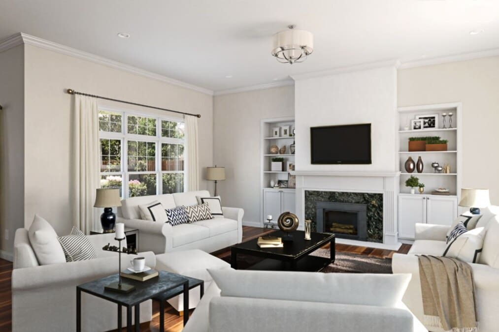
A white that looks perfect in the store may clash with your home’s existing features. Flooring, countertops, trim, cabinetry, and even large furniture pieces all influence how white paint is perceived. These fixed elements carry their own undertones, which can either complement or conflict with your wall color.
Common fixed elements that influence paint selection include:
- Wood flooring: Warm-toned woods pair best with creamy whites. Cool-toned floors need softer or neutral whites to balance.
- Stone countertops or tile: Marble or granite with gray veining favors cooler whites. Beige or taupe materials need warmth.
- Trim and molding: Bright white trim can make off-white walls look dingy if undertones don’t align.
Professionals assess how these finishes interact before choosing a wall color. They also consider whether the space is open-concept or segmented, which impacts how colors transition from room to room. Inconsistent tones can make a home feel disjointed, especially in natural light.
Choosing a white that works with your surroundings ensures your space feels cohesive, not chaotic.
4. Use the Right Sheen for the Right Surface
The finish, or sheen, of your paint affects both its appearance and performance — especially when using white. The same white in flat and satin finishes can look like two different colors under light. Sheen also controls how much light reflects off the surface, which affects how clean or polished a room feels.
Common sheens and their best uses include:
- Flat or matte: Best for ceilings or low-traffic walls. Hides imperfections but is less washable.
- Eggshell: Slightly more durable, ideal for living rooms or bedrooms with moderate activity.
- Satin: Smooth and easy to clean, great for kitchens, bathrooms, or hallways.
- Semi-gloss or gloss: Reflective and durable, perfect for trim, doors, and baseboards.
A professional painter considers both aesthetic and practical needs when recommending sheen. High-traffic areas need more durability, while large open walls benefit from a softer, light-diffusing finish.
Sheen isn’t just about looks — it’s part of how the space functions and feels.
5. Test Before You Commit: Sample Like a Pro
Even when a white shade looks perfect in theory, it can behave very differently once it’s on the wall. Lighting, undertones, and existing finishes all shift how paint appears in a real room. That’s why professional painters always test first — and not just with one small patch.
Here’s how to sample white paint correctly:
- Apply samples to multiple walls, including both sunlit and shaded areas.
- Check paint at different times of day to see how natural and artificial light affect it.
- Use large swatches or brush-out boards to better visualize the color in context.
- Avoid testing near brightly colored furniture or floors that may distort perception.
Experts also pay attention to dry time. Many white paints change slightly in tone as they cure. Rushing into a full room application without sampling can lead to costly repaints.
With professional testing, you won’t just get a white that looks good — you’ll get one that works with your home and light.
White Isn’t Basic — It’s Strategic
Choosing white paint sounds simple, but the wrong shade can make a space feel cold, flat, or disconnected. The right white, on the other hand, brings balance, enhances natural light, and works beautifully with your home’s fixed finishes and layout.
Professional painters understand how undertones, lighting, surface sheen, and surrounding materials all work together. They don’t guess — they test, compare, and apply white paint in ways that elevate your space and avoid expensive repainting down the line.
Thinking about repainting your interior walls? Start with a consultation to find the perfect white — and get it done right the first time.